Read About the Artistic Process Behind deviant Cursive
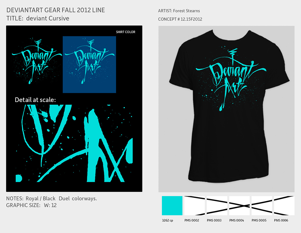
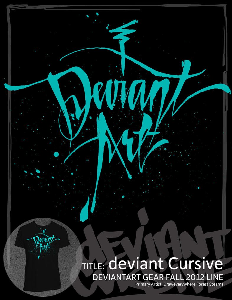
deviant Cursive
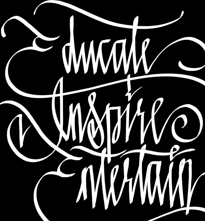
Traditional Style with a Modern EdgeToday, I'm thrilled to tell you about Cursive. This design was a definitely trying, but it worked out well in the end. Plus, I had fun in the process and want to share with you this little art tip. Move your whole body as you draw for fluid strokes and dynamic lines. It really works and I had fun practicing that technique during this piece.
Sometimes the simplest pieces take the most time to perfect. It's one thing to draw a word all crazy and let the color scheme carry it visually, but to write words in an elegant form can be difficult to perfect. You'll see throughout the story of this piece many iterations the piece went through. I think I wrote this out over 100 times before I felt that it had the right essence.
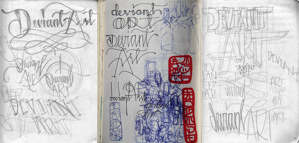
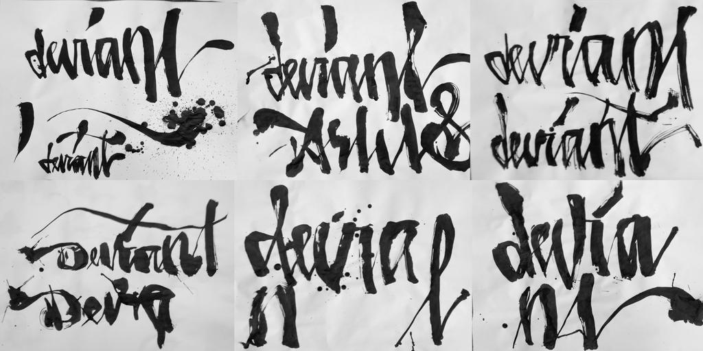
The concept started in pencil, using many variations of letter forms and fonts to see if one of them would catch my attention. Script styles quickly caught my eye, but I was not sold on which medium to use. So I explored many.
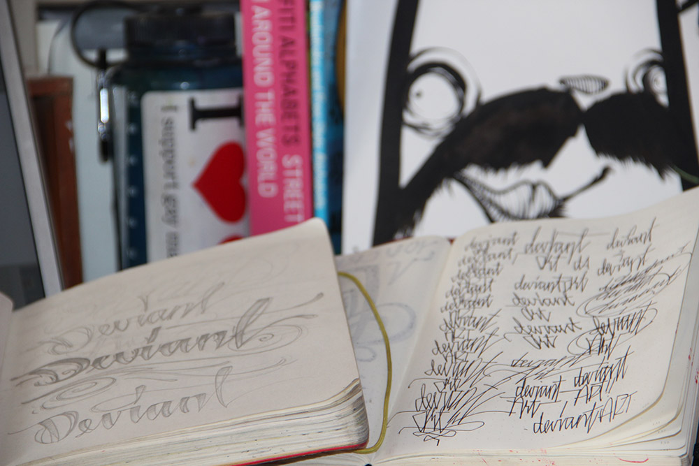
I love using felt-tipped pens mixed with China Markers brand to make certain effects.
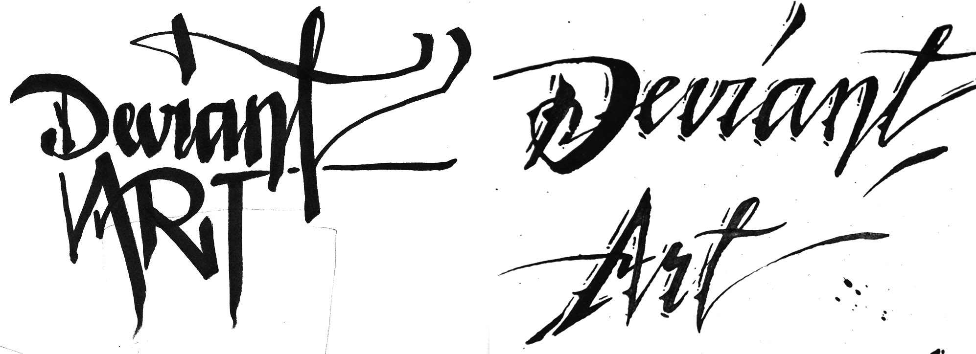
When I took it digital, I manipulated the piece into sterile vector curves. It was nice, but didn't convey the energy I was going for.
Ultimately, I moved on to huge sheets of paper where I was able to write with my whole body in motion; it's quite a lot of fun to write like this.
Despite the fun, it was a big artistic mess. I was frustrated because I wasn't finding success on a piece that I originally thought would be cake. So, I did what most artists would do: the opposite of whatever I was doing.
The letters come together at the bottom much like a triangle. The final drawing was only a few inches tall, but I knew that it would turn out nicely when fully expanded across the garment.
I pulled out my metal quill-top dip pens and tried doing the words in a few forms -- upright, italic, reverse tilt. After much vigor, I finally emerged with this composition.
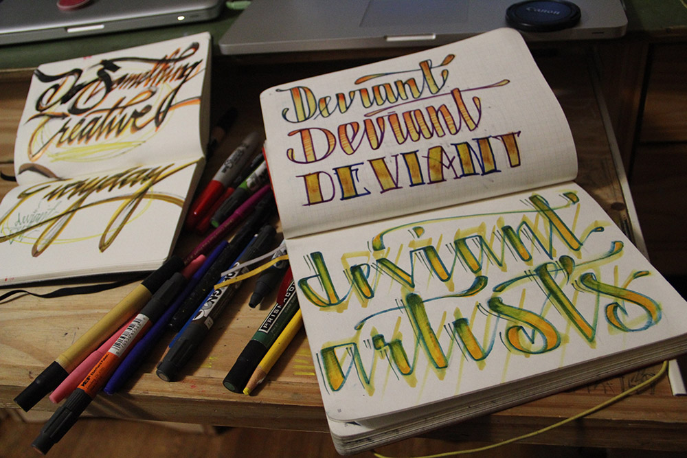
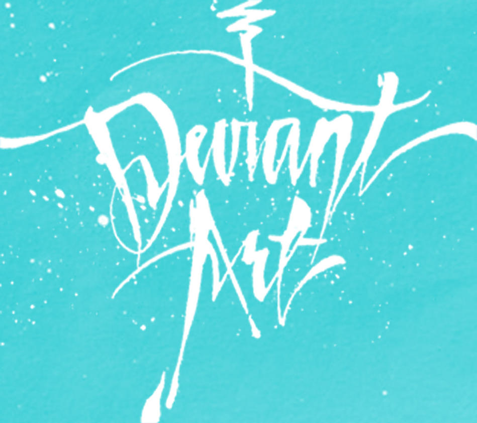
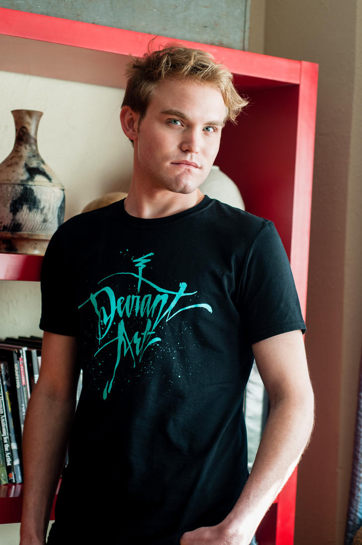
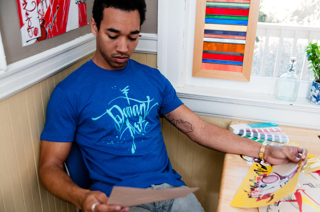
I had some ideas for colorways and couldn't narrow down to one. Ultimately, I chose two shirts that would work well with the bright-blue ink color.
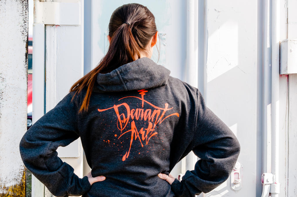
When asked to lay it out for a new HoodieBuddie (hoodies with built-in headphones) design, I was mostly inspired by the contrasting color of bright orange on the charcoal-grey canvas. This one really pops. It's a joy to see the graphic show up on these fabrics, and it's especially fulfilling to see the final developed garment.
This piece had a very interesting journey to get to its final edition, and I loved every minute of it. As always, I would be happy to chat with you about this Journal or any other topics you all want to discuss. I'm happy to have this opportunity to communicate the intentions behind each piece and share with you my artistic process. I hope to learn more about yours, too!
This product is now available in the deviantART T-Shirts & Gear Shop. Click here to shop this and other new items in the 2012 Holiday Collection. Click here to shop the new deviant Cursive Hoodie!